In: website design
When updating the look and feel of an established brand, it is important to build on the brand’s heritage, to improve on their strengths and appeal to a new generation of consumers without alienating existing relationships. This is something John Jewell Design kept in mind when working with the internationally recognised Stanton & Killeen range.
The brief was to create a range of labels that reflected a sense of place and touched on the long history of the winery.
John Jewell Design developed a comprehensive look and feel that is truly in sync with the overall brand identity. From the Icon range through to the Limited Release, Premium and Everyday range the new labels project a sense of heritage and quality, with the use of rich gold speaking to the distinguished nature of the wines.
We feel the new labels stay true to our 140 year history, yet also invite new people to connect with our brand using contemporary design elements.Natasha Killeen
John Jewell Design also rebuilt the Stanton & Killeen Wines website which was very outdated in both look and functionality. Launched in February this year the new site has been a great success creating a modern, user-friendly design that unifies the Stanton & Killeen brand.

A great way to start the new year!
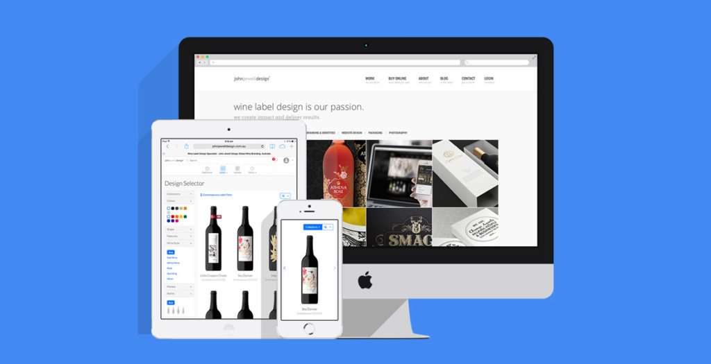
John Jewell design has kicked off 2014 with a brand new website that leads the way in both functionality and design.
With sharp lines and a crisp, clean aesthetic, the site is easy to navigate and provides the perfect setting for showcasing the best that John Jewell Design has to offer.
The new-look site boasts brand-new features such as the sophisticated “Design Selector”. It allows clients to search and filter label designs, get up close and personal with the easy-to-use zoom function, as well as reserve or store their favourite label designs.
Accompanying the release of the site, John Jewell Design has also launched two inspired new collections within their label catalogue. The “Promo Sale” collection is aimed at clients that have a tight budget and timeframe. It delivers premium, inexpensive design concepts ready for immediate use. The “Shrink Sleeve” collection is an innovative way to enhance any brand and achieve maximum shelf appeal.
All of these features work seamlessly across a range of different platforms, whether it be PC or Mac, phone or tablet, you can access the site from wherever you are.
14/02/2013
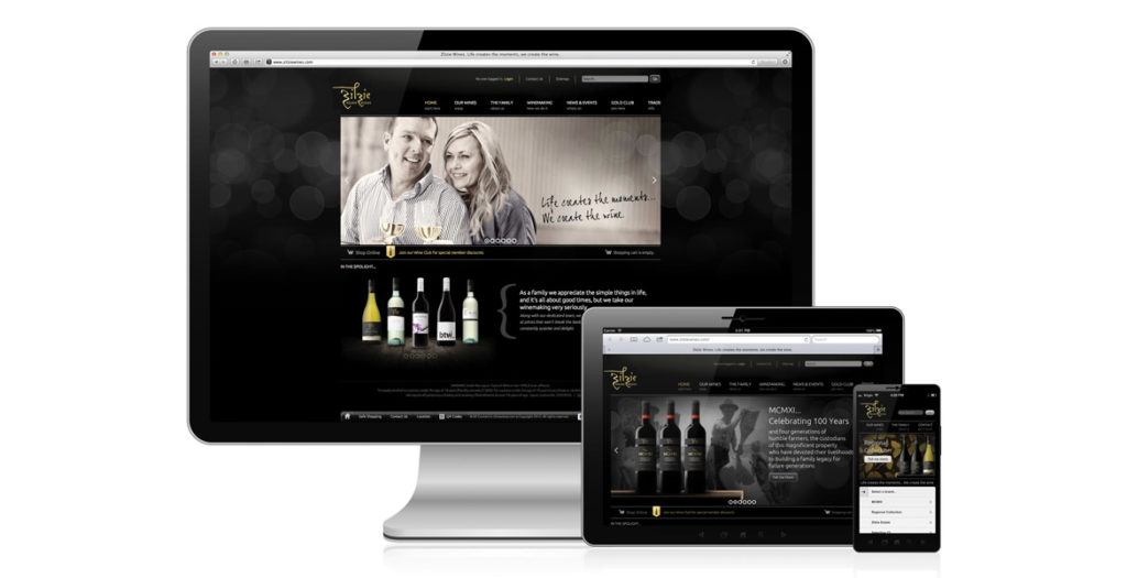
New Work: Zilzie Wines Website

It’s not enough these days for websites to just look “pretty”, they need to be fully functional across a range of different platforms (desktop, tablet and mobile devices), as well as provide users with an interface that is easy to use, and our clients with a content management system that allows them to change their website at a moment’s notice.
We had all this in mind when taking onboard the task of rebuilding the Zilzie Wines website.
Zilzie were looking for a site that would reflect their new wine branding, as well provide consumers with a personalized experience that would encourage purchase through the online store, as well as repeat visits to the site.
The build process we undertake at John Jewell Design is all-encompassing and includes website analysis, concept development, social media integration, testing over multiple platforms, and even staff training. We also believe in taking a collaborative approach with our clients, and we worked hand-in-hand with the Zilzie team throughout the process to ensure that the finished product delivered well beyond expectations.
A word from Zilzie…
The e-commerce channel is growing and changing everyday, JJD was able to offer the creative vision and technical know-how to build not only an impressive looking website, but a functional shopping cart that is easy for our wine-club members to navigate. Nothing usually beats on time and on budget, but we also regained control, JJD provided a manual and training, giving us the capabilities to edit 100% of our website so that it can change and grow alongside our business.
Carolyn Simonis, Zilzie Wines


