In: off-the-shelf
22/06/2018
Blurring the Lines
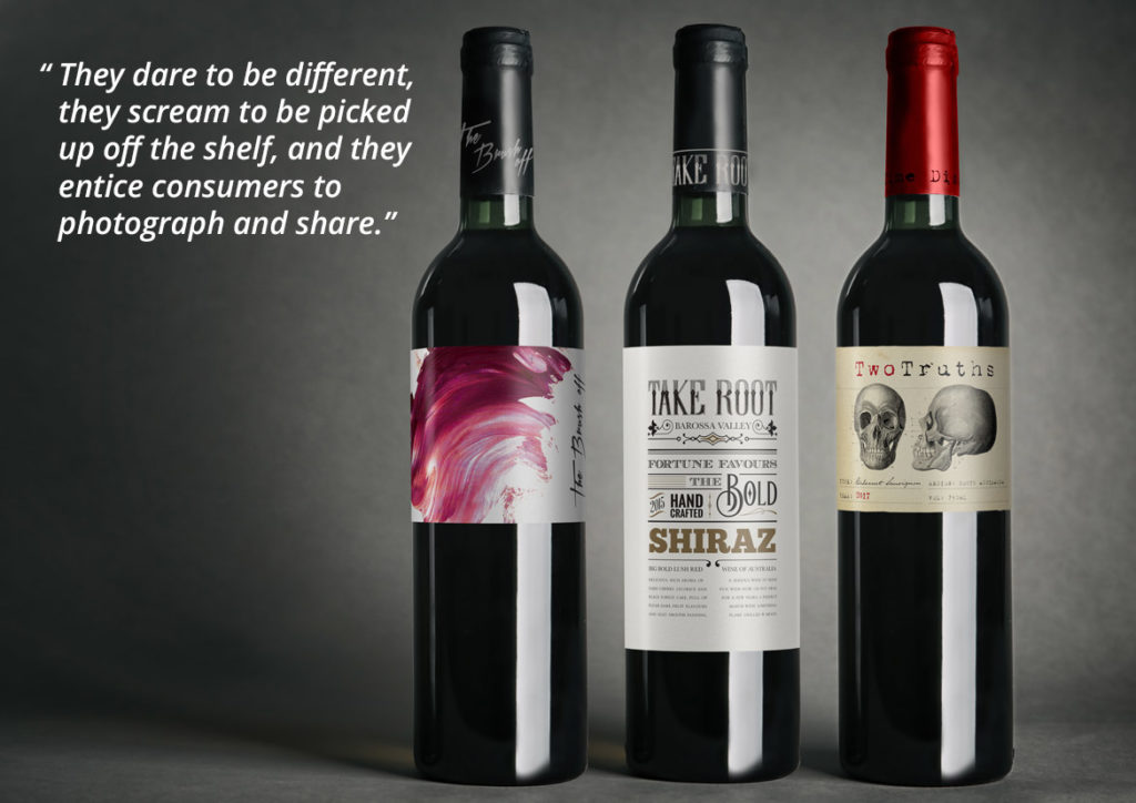
The wine industry has started to move away from the tradition of distinguished, stately wine labels and is trending towards the more youthful, out-there labels commonly employed by craft beers.
As consumers become more familiar with seeing these labels on their local bottle shop shelves, as well as on their hip inner-city café tables, they are coming to expect their wine labels to follow suit.
There are two key trends that have emerged as a result of this shift. The first are labels that are dominated by typography, lending a vintage, yet quirky feel. This was a trend that ignited about 10 years ago but quickly disappeared. It is now making a strong and decisive come back.
The second key trend is wine labels that don’t look like wine labels. They carry no distinguishable wine information on the front label and are primarily image driven. They dare to be different, they scream to be picked up off the shelf, and they entice consumers to photograph and share.
These shifts are already happening, with key markets being the UK, USA and China. If you’re interested in hearing more about these current wine label trends, as well as benefiting from John Jewell Design’s in depth understanding of the industry, contact the team on 02 6040 4433.
15/08/2017
Reshaping the Wine Industry
At John Jewell Design we invest in understanding trends. We don’t consider it a nicety, it’s a necessity. We research, we travel, we observe and we process all this knowledge to deliver designs for our clients that reflect emerging market needs.
Some people may be surprised to learn that we don’t start with design; that’s where we finish. We are fully immersed in the nuances and intricacies of the wine industry landscape, and it’s here that we find our starting point. This knowledge informs our design direction and how we advise our clients.
Whether it’s a private label design or a refresh of a current brand the rules are the same, always start with what’s driving the consumer at that point in time. We can fully understand our client’s needs because we are across the trends that will influence their customer’s buying habits and this allows us to give clients what they need: labels that drive results.
Trends in wine label design – as in any design-driven industry – tend to be cyclical, with labels that may have been popular a decade ago suddenly enjoying a revival among the masses. We’ve seen this recently with typographic labels and the art is in knowing how to rework these designs for a market that is split between those who nostalgically remember the first incarnation, and those who are experiencing this trend for the first time.
Clients can sometimes be hesitant to revisit past trends, but a willingness to take a calculated step back in time can often result in taking a big step forward.

In addition to being immersed in these trends, we also appreciate how imperative it is to constantly develop as an industry. To evoke real, meaningful change that continues to attract and captivate customers, we also need to be constantly pushing the envelope for what is possible. We are continually experimenting with designs, techniques and processes to develop label design concepts that have never been done before. This provides our clients with options that can’t be found elsewhere.
Customers are constantly changing and evolving. As an industry, we need to keep evolving too. At John Jewell Design we’re making a contribution to this evolution. One label at a time.
19/03/2017
Emerging Wine Label Trends for 2017
John’s travels always provide a wealth of knowledge regarding emerging trends and shifts in the market and his latest expeditions overseas were certainly no different. Want to know what role craft beers are playing and how drinks other than wines are leading the charge? Then read on….
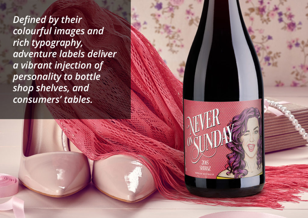
The industry has started to move away from the tradition of distinguished, stately wine labels and is trending towards the more youthful, out-there labels commonly employed by craft beers. As consumers become more familiar with seeing these labels on their local bottle shop shelves, as well as on their hip inner-city café tables, they are coming to expect their wine labels to follow suit. They don’t want labels that just sit back and wait to be noticed, they want something that jumps out at them, grabs their attention and demands to be photographed for their social media feeds.
There are two key trends that have emerged as a result of this shift and interestingly the first is one that ignited about 10 years ago but disappeared almost as quickly as it appeared. We are talking about labels that are dominated by typography, lending a vintage, yet quirky feel. These often employ subtle uses of colour and occasional imagery but none of this distracts from the hero of the label, which is the typography. It’s bold, it’s confident and it’s making a comeback.

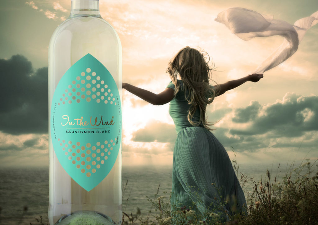
The second key trend is even more curious than the first in that they are wine labels that don’t look like wine labels. They carry no distinguishable wine information on the front label and could be at home on the front of any type of beverage. These labels are image driven, designed to immediately capture attention, evoke an emotion and start a conversation. They dare to be different, they scream to be picked up off the shelf, and they entice consumers to photograph and share. On the shelf, they rely on the bottle itself as the sole wine identifier, preferring to keep all wine-related information to the back of the bottle.

These shifts are already happening, with key markets being the UK, USA and China. If you’re interested in hearing more about these current wine label trends, as well as benefiting from John Jewell Design’s in depth understanding of the industry, contact the team.
06/11/2016
Online Wine Label Solutions
The benefits of buying off-the-shelf
It all starts with understanding your market, and then building a memorable brand that is brought to life through outstanding design. It’s about cutting through shelf clutter so your wine is the stand-out choice for your customer.
Here at John Jewell Design, we are constantly travelling and studying the wine markets around the world. This is to ensure our wine label offerings target the unique needs of the many different wine businesses, both here in Australia and abroad.
In addition to our extensive bespoke design services, we have used this expert knowledge to create a considered collection of wine label designs, all available for immediate perusal and purchase via the John Jewell Design website.
This online gallery takes the guesswork out of choosing a wine label by guiding you through the selection process. You can search by a particular design style, which is perfect for when you already have an idea about the type of label you require. Or alternatively, you can search by country, to be shown styles that are best suited to your specific market.
Depending on your requirements, you can also explore our different tiers, as we know every one has their own design needs and budgets. The VALUE section offers exactly that – fantastic front label designs at a pocket-friendly price. Or you can step up to the PREMIUM section if you require a full suite of design elements. All premium concepts include a unique brand name, a front label and back label design, plus capsule graphics. You can also search the Organic Wine Infusions section, which has been created specifically for this niche and emerging segment.
All label designs are print-ready and deliverable worldwide, resulting in fast turn-around times to get your product straight to market.
To protect the exclusivity of the labels on offer, access to the gallery is via invitation only. So if you’re in need of a new wine label and want to be guided by the best in the business, we invite you to get in touch today.
Contact Elise on please enable javascript to view or +61 (0)2 6040 4433 Monday to Thursday or send us your details and we’ll get back to you. Once approved we will email you your individual username and password.
24/01/2016
Wine Infusions
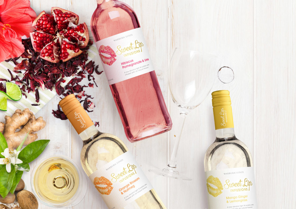
The whispers about wine infusions are now a buzz that cannot be ignored.
Led by European trends, predominately from Germany and the Netherlands, this category is growing rapidly. Winemakers and retailers alike are making strong moves towards wine infusions in an effort to secure the coveted 18-24 female demographic.
But what exactly is it that attracts consumers to wine infusions, and how can your label design capitalise on this trend?
There’s a whole host of reasons why wine infusions are generating so much interest amongst consumers. First and foremost, wine infusions are both lower in alcohol and lower in calories. For 18-24 year old females – who are generally very health conscious – this alone is hugely enticing.
Secondly, the addition of natural plant and fruit flavours means the wine infusions have a hint of sweetness that makes for a far more palatable drinking experience for those new to the world of wine. This, combined with the addition of a light spritz, makes for an overall easy drinking experience, particularly served over ice in the warmer months.
To a wine novice, the “rules” around wine can be confusing, and traditional wine blends are often perceived as harsh and too dry for an untrained palate. Fruit-driven infusions remove the mysticism around wine, providing a sweet, satisfying entry point for new consumers.
All this must be kept in mind when developing labels for wine infusion brands. It’s important to ensure the labels are both accessible and engaging to appeal to the new generation of wine consumer, steering clear of any old-world wine label cues. Labels should be bright and fun, reflecting the vibrant colours of the wine infusions themselves, whilst maintaining an overall finish that is both fresh and uncluttered.
The recently designed Sweet Lips reflects the above thinking. The label employs vibrant, striking colour that simultaneously draws the eye and acts as a subconscious cue to the flavours within. The vivid colours are given room to shine on a crisp white background with minimal distractions, while the use of gold foil adds a premium feel to the label.
If you’re interested in developing your own wine infusion brand, John Jewell Design has a range of off-the-shelf options available on their website for you to review and purchase. Check them out here.
A great way to start the new year!
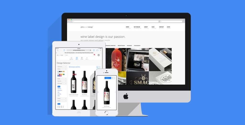
John Jewell design has kicked off 2014 with a brand new website that leads the way in both functionality and design.
With sharp lines and a crisp, clean aesthetic, the site is easy to navigate and provides the perfect setting for showcasing the best that John Jewell Design has to offer.
The new-look site boasts brand-new features such as the sophisticated “Design Selector”. It allows clients to search and filter label designs, get up close and personal with the easy-to-use zoom function, as well as reserve or store their favourite label designs.
Accompanying the release of the site, John Jewell Design has also launched two inspired new collections within their label catalogue. The “Promo Sale” collection is aimed at clients that have a tight budget and timeframe. It delivers premium, inexpensive design concepts ready for immediate use. The “Shrink Sleeve” collection is an innovative way to enhance any brand and achieve maximum shelf appeal.
All of these features work seamlessly across a range of different platforms, whether it be PC or Mac, phone or tablet, you can access the site from wherever you are.
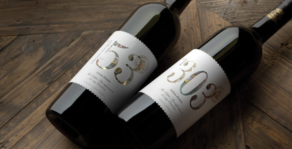
We have been very impressed with the design of our 2 labels, the ‘53’ and ‘303’. John Jewell Design has struck just the right balance in creating something of a contemporary style while at the same time maintaining a distinct level of elegance and sophistication, which is perhaps more associated with traditional ‘old world’ label design.
We needed something that would be eye-catching and stand out on the shelf, yet at the same time we needed to be mindful of what consumers in our target market have come to expect in terms of wine label design. It couldn’t be anything too eclectic and ‘out there’, but we also wanted to get away from some of the boring clichés common of the more traditional label styles. John’s design accomplished all of that, and we could not be happier with how our target consumers have responded to these labels. The end result has been a pair of labels that are stylish, attractive to the eye and unique in their own way.
Josh Sawyer, Marketing Coordinator Mica Australia
28/03/2013
Catalogue Revamp
In the last three months John Jewell Design has been working hard to create new innovative wine label designs for our catalogue. There are now over 250 wine labels for our clients to choose from in all styles to suit your needs. These labels can be accessed from our online catalogue.
Happy browsing.
