September 2013

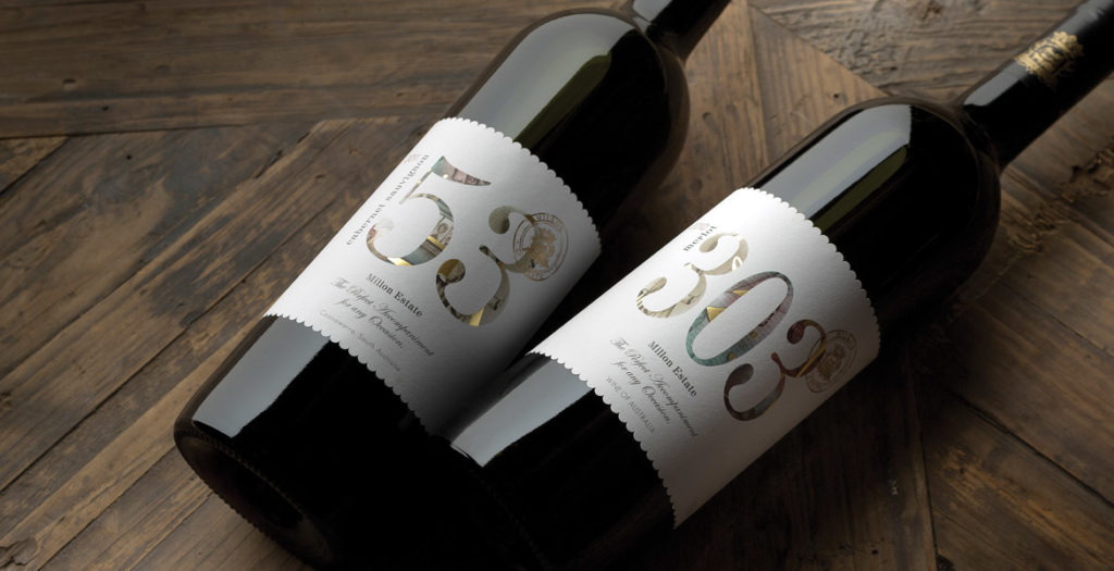
We have been very impressed with the design of our 2 labels, the ‘53’ and ‘303’. John Jewell Design has struck just the right balance in creating something of a contemporary style while at the same time maintaining a distinct level of elegance and sophistication, which is perhaps more associated with traditional ‘old world’ label design.
We needed something that would be eye-catching and stand out on the shelf, yet at the same time we needed to be mindful of what consumers in our target market have come to expect in terms of wine label design. It couldn’t be anything too eclectic and ‘out there’, but we also wanted to get away from some of the boring clichés common of the more traditional label styles. John’s design accomplished all of that, and we could not be happier with how our target consumers have responded to these labels. The end result has been a pair of labels that are stylish, attractive to the eye and unique in their own way.
Josh Sawyer, Marketing Coordinator Mica Australia
