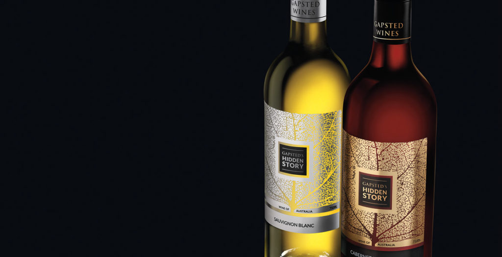
The innovation of the Hidden Story label lies in the combination and application of both paper, gold and silver foils on a clear adhesive label stock. This development for wine labels delivers a premium expensive look for a global market whilst still being cost effective for the client.
John Jewell Design devised the concept for the label, then sent the artwork to printing partners in Germany to prepare full-spec mock-ups for review. The print results were astounding and the overall concept achieved the brief of producing a label that would create maximum interest in a crowded retail environment, whilst delivering something not often seen in the industry.
The design’s objective was to convey the family lineage through a simple graphic representation. This was achieved twofold by illustrating the detailed veins of a leaf, which, upon further inspection, also depicts the silhouette of a tree. Both interpretations of the image symbolising the Gapsted Wines family tree.
So as not to detract from the powerful design, the branding was purposely kept to a minimum, and instead of producing a text heavy back label, a QR code is utilised, leading consumers to the Gapsted website for further information about the brand and the wines.

